CSS
CSS Introduction
CSS Selectors
CSS Color
CSS Background
CSS Border
CSS Margin
CSS Padding
CSS Box Model
CSS Text
CSS Font
CSS Link
CSS List
CSS Overflow
CSS Display
CSS Combinators
CSS Pseudo-classes
CSS Navigation Bar
CSS Hover
CSS Z-index
CSS Media Queries
CSS Shadow
CSS 2D Transform
CSS Animations
CSS Button
CSS FlexBox
CSS Grid
CSS Pagination
CSS FlexBox
FlexBox makes easier to layout, align, and style items in a container while maintaining the responsiveness of the website.
To create a flexbox, you need to set the display of the container as flex.
Flex Container Properties
The flex container properties are:
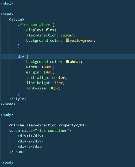
It defines in which direction the flex elements would be displayed. It takes values like row, column, or "reverse" too.
By using this property, we can make our elements responsive for different screen sizes.
This property is used to set the position of content or rather align content along the main axis.
Just like the justify-content property, align-items defines the alignment of the flex container but along the cross-axis.
Example
{display: flex;}
1. Flex Direction
Example